allora magazine
spreads // design + writing + photography
allora —
With no direct translation to English, allora is a transitionary moment of pause and contemplation. An integral part of an Italian’s vocabulary, the word set the tone for Allora — a magazine reflecting on a semester spent abroad in Italy. In a truly group effort, sixteen students (with lots of guidance from our professor Meta Newhouse) created an entire magazine in two weeks, from concept to print.
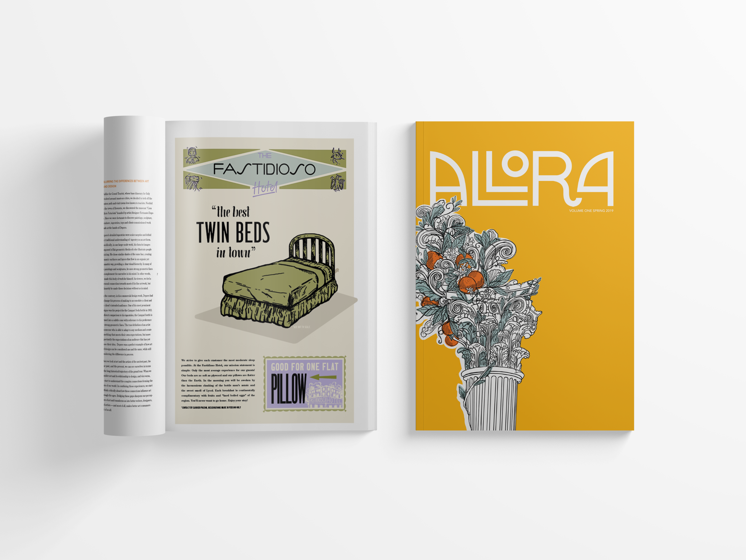
Fastidioso Hotel —
layout + hand lettering
Translating to the Annoying Hotel, the spoof ad is an ode to three months of twin beds, flat pillows, and things that go bump in the night. Created with Sarah Budeski and Matt Biasotti, I focused on the hand lettering and page layout. The ad is displayed beside the cover of Allora, for which the masthead team won a Communication Arts Award of Excellence in the 2019 Typography Annual.
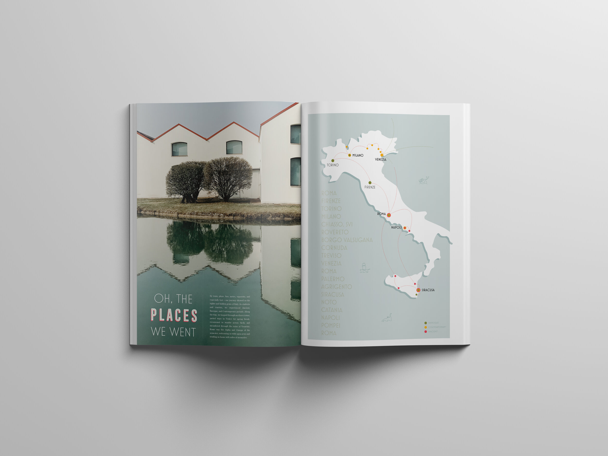
Oh, the Places We Went —
illustration + writing + layout + photography
As one of the first pages readers encounter in Allora, the spread features a map tracing our journey across Italy. Three months, nineteen cities. The map retraces our route while also showing what art periods we were studying in each location, serving as a reference guide for the rest of the magazine.
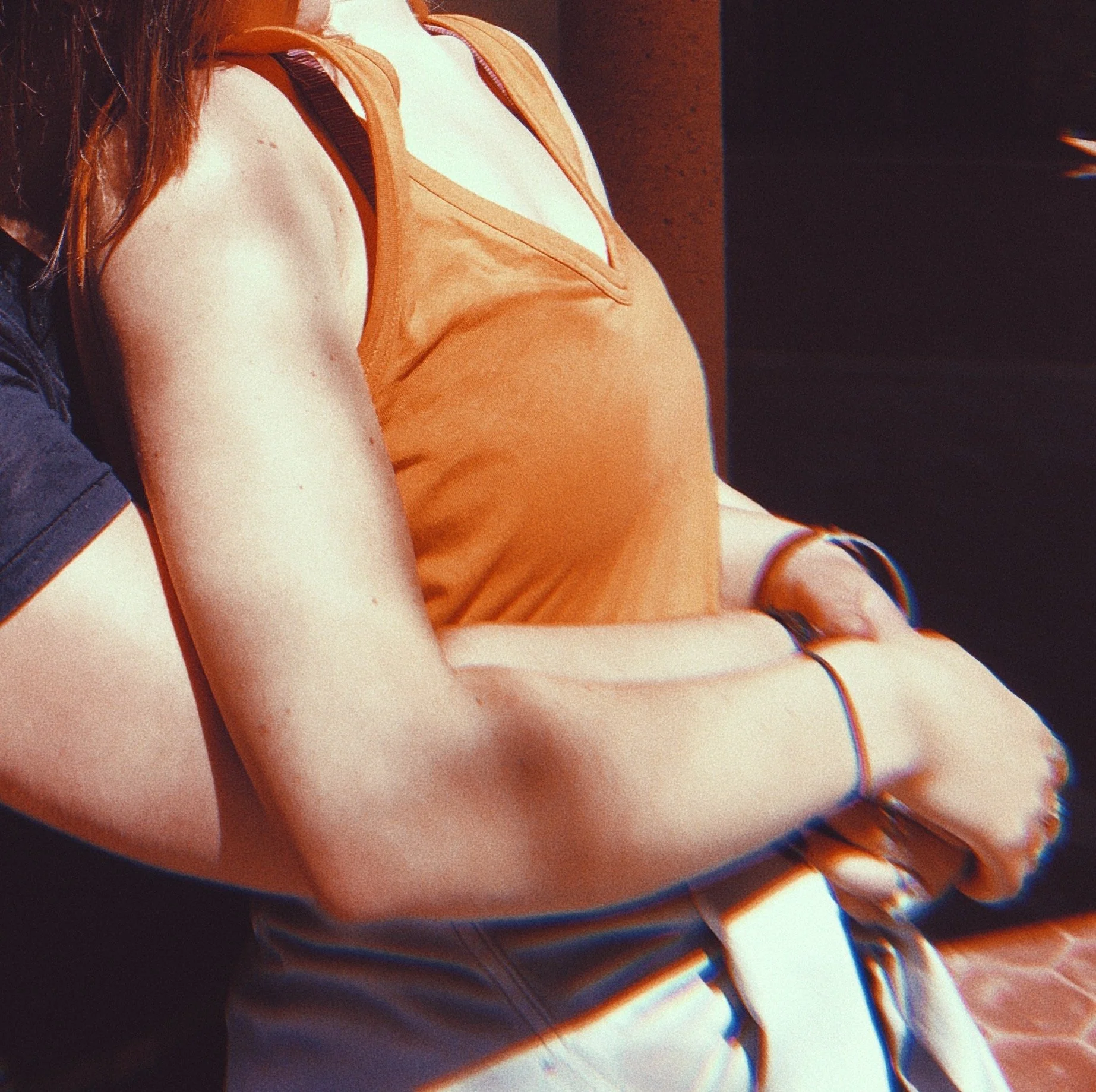
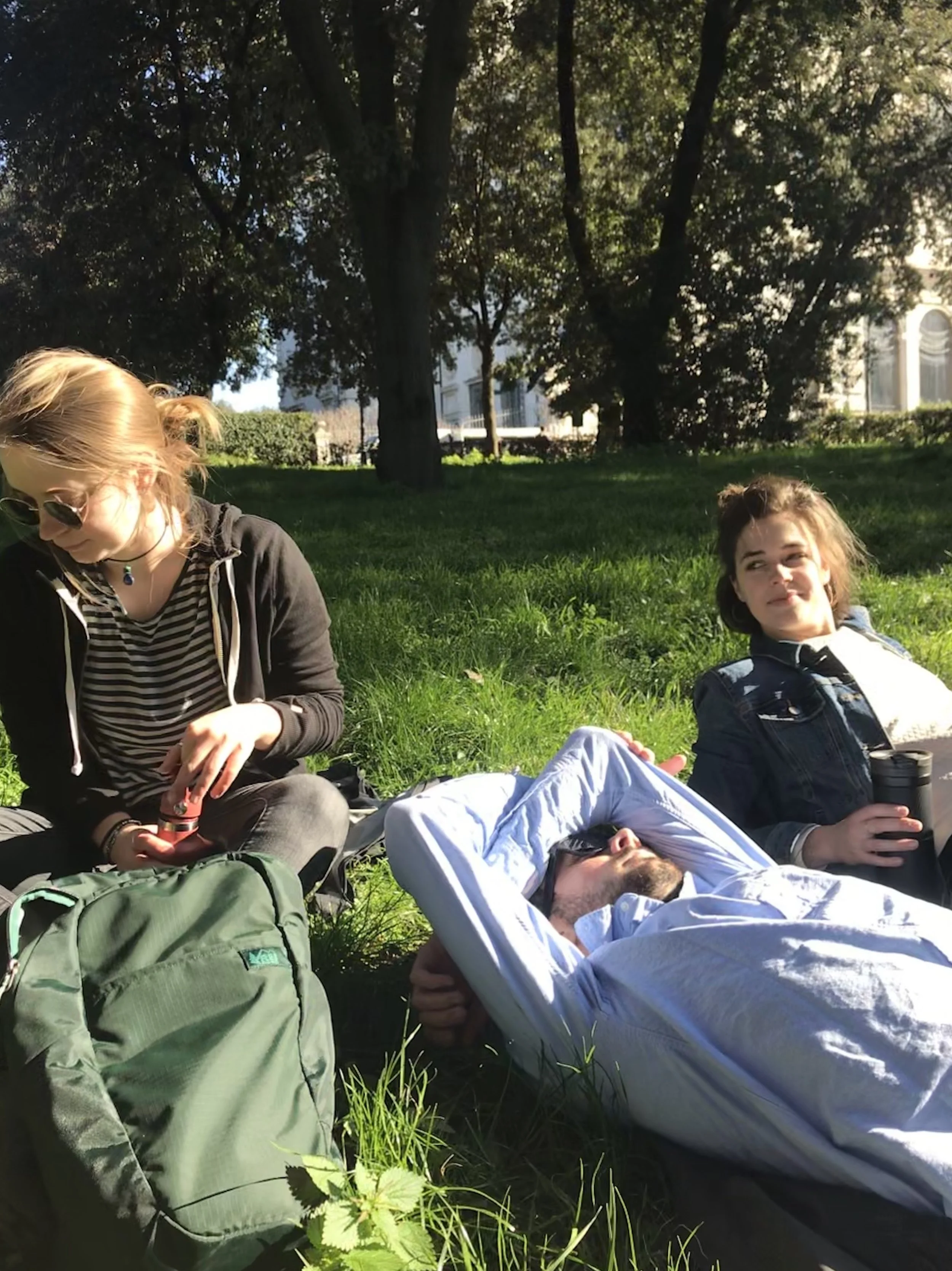
wait, what about those undies?
No matter where you are in Italy, it’s hard to walk a block without seeing someone’s unmentionables. Taking a cue from the locals, we weren’t afraid to share some usually private parts of ourselves within the magazine, documenting the good and bad of our experience.
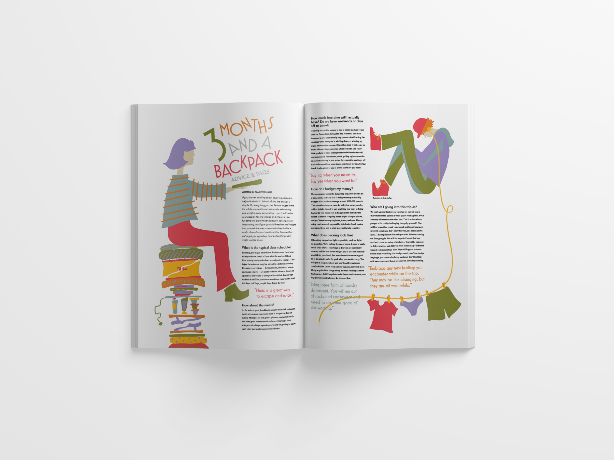
3 Months and a Backpack —
illustration + layout
This colorful editorial spread answers some frequently asked questions about studying abroad. The lighthearted illustrations relate to advice given in the article—from what all to pack for an extended trip, to how to do laundry on the road.
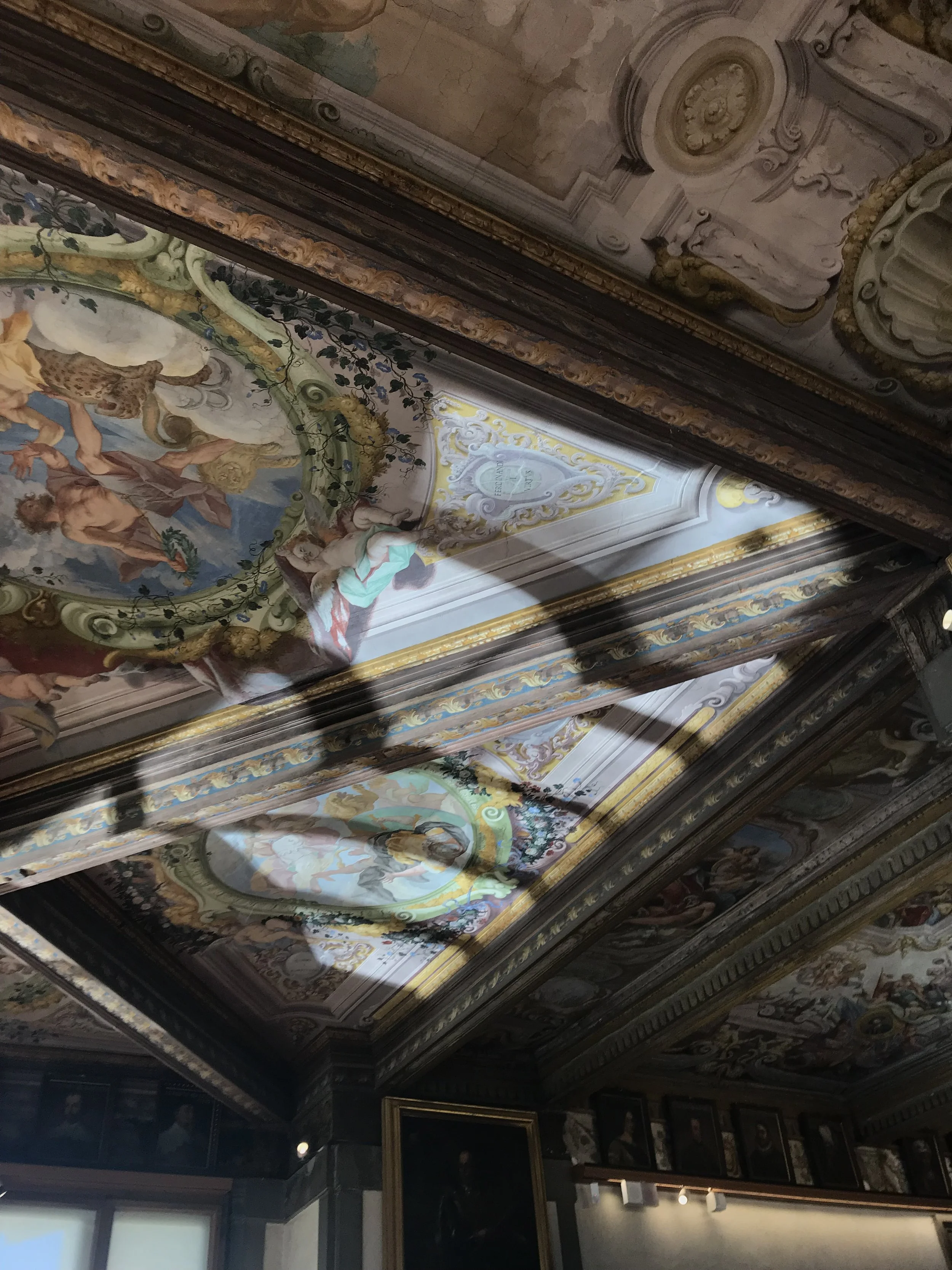
Baroque, Then and Now —
layout + writing + photography
In another collaborative spread, I partnered with Sarah Budeski to compare the Baroque period of the 17th Century to modern artists exploring the same themes. We co-wrote the article and I incorporated her illustrated elements into a cohesive layout that visualizes the drama that has captured imaginations for centuries.